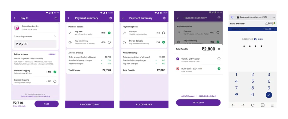
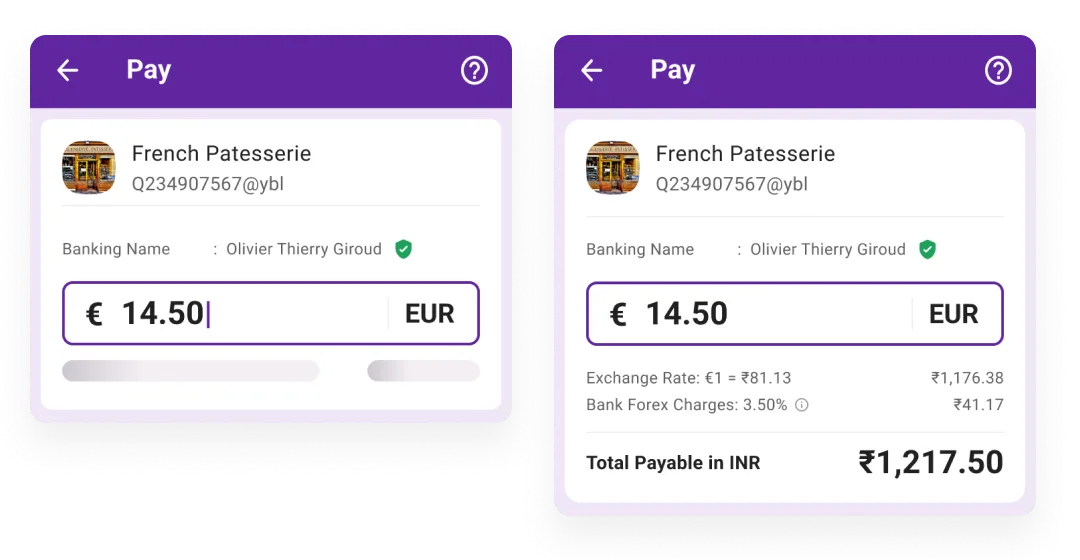
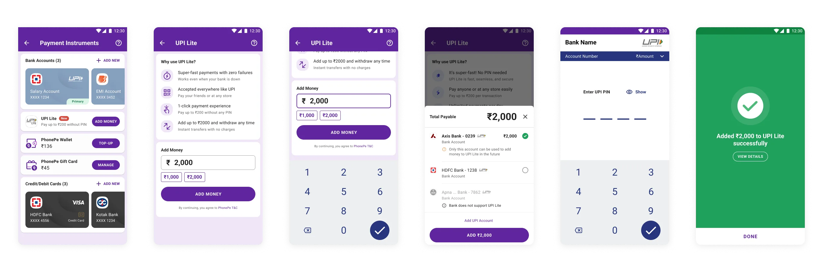
PhonePe lets 400M+ Indians do almost anything with money: pay a person, pay a merchant, clear a bill, recharge a phone, check a balance, buy gold, hold a policy. It does all of it one payment at a time. There is no way to gather several payments and clear them in one shot.
This is the story of designing that missing piece, a cart for a payments app, and of the harder judgment underneath it: whether a cart belongs in PhonePe at all.
The gap
Every job on PhonePe is a single, complete task. You pay one bill, then leave. You recharge one number, then leave. For a household that runs on the app, the electricity bill, two phone recharges, the DTH, a FasTag, and a school fee become five separate errands through five separate funnels.
Nowhere could a user say "these five, together, now." The one-shot, bulk payment simply did not exist. The exploration started there: what would it take to let people batch payments and clear them once.
How Indians actually use carts
PhonePe had no cart precedent to borrow from, so I went to where Indians already meet carts every day. I studied cart behaviour across three contexts: marketplace (Amazon, Flipkart), fashion (Myntra, Nykaa, Zara), and quick-commerce and food (Zepto, Blinkit, Swiggy).
The framing question was blunt: how do Indians actually use carts. The research handed me one distinction, and it set everything that came after.
A payments cart is not a shopping cart
A shopping cart holds things you want and might abandon. A payments cart holds obligations: a bill that is due, a recharge about to expire, a premium that recurs. Every item in it is a debt you already owe, sitting across unrelated categories, and most of them are time-bound and dynamically priced.
That distinction set the shape of the work. The cart had to hold items that expire, prices that move, and categories that refuse to mix.
From user stories to a structure
I opened with a short design-thinking sprint: write the demand as user stories, then group them. The demand was wide. Pay every pending bill under MyBills at once. Pay multiple FasTag recharges across vehicles. Pay several credit-card dues together. Buy multiple gift vouchers in one go. Two contacts at the same time.
The stories grouped into three buckets, and the grouping was the design:
- Bulk payments: the jobs. Batch heterogeneous payments across categories.
- Selection: cart mechanics. Add, remove, quantity, and a live price on every change.
- Information: the live state of the cart. Availability, offer-qualification, discounts, and the reality that almost every edit is time-bound.
Bulk payments and Selection are ordinary cart work. Information is where a payments cart becomes its own problem, because the items keep changing underneath you, and the cart has to keep telling the truth about them. That bucket held most of the real design.
A cart that stays out of the way
PhonePe's reputation is built on going in, doing one thing, and leaving. A cart risks turning that into a shopping trip. So the first architectural decision was to keep the cart opt-in.
The core flow turns on one question: does this qualify for a cart order. A payment that does not qualify runs down the existing single-payment path, untouched. A payment that does gets a cart instance created around it. The capability lands on top of the app that 400M people rely on, and the main path stays exactly as it was for anyone who never asks for a cart.
The research paid off here directly: incompatible items trigger a reset warning built on Swiggy's "clear the cart when you switch" gesture, because Indians already read that gesture from food delivery.
Scope: where a cart earns its place
The user stories covered the whole super app. Building for all of it would have been a mistake. I scoped the work to Recharge and Bill Payments (RCBP) as the core, with Insurance as a second, contested vertical.
RCBP is cart-native: recurring, repeated, naturally plural (multiple numbers, multiple bills). Insurance sits at the other end. People rarely buy two policies at once, the checkout carries dense summary information a cart would flatten, and a cart step lengthens an already fragile funnel. I put that tension on the board and left it there: for Insurance, the cart added a hurdle and earned nothing back. Reading where a pattern helps and where it costs you was the whole point of scoping.
One cart, many item types
The cart is one construct, and each item type carries its own affordances, because the things inside a payments cart behave differently:
- A recharge cannot be a quantity; you do not buy "three" of a plan. Its row has no stepper, and change or delete sit in an overflow menu, off the row, safe from a fat finger. Adding another recharge routes back through the recharge flow.
- A gold or silver coin can be a quantity, so it gets a stepper, and dropping it to zero removes it, matching a habit people already carry from e-commerce. It also holds a price-lock countdown, because a commodity's price expires while it waits in the cart.
- An add-on (a Hotstar or Prime bundle on a recharge) is a single checkbox.
One cart, three behaviours, set by what each item actually is. Removing one item and clearing the whole cart stay separate actions, each with its own confirmation, because a cart cleared by accident is a bad way to learn a new feature.
The hard part: when one of two payments fails
A single payment is atomic: one payment, one outcome. A bulk payment breaks that. Pay two recharges together and one can clear while the other fails.
I made the bulk payment a first-class order that groups its transactions, and I wrote down the cost of that choice: reaching a single transaction inside an order takes more taps than PhonePe's flat history. The post-transaction experience covers all three outcomes, success, partial completion, and failure, each showing the status of every item and each speaking to the money worry directly ("if money was debited, it will be refunded within 24 hours").
The partial state is the one that matters. A single-payment app never faces it. A bulk cart has to get it right, or the whole idea falls apart in the one moment a user is most anxious.
Monetization without breaking the funnel
A cart is also a revenue surface, and that is where it can turn on you. I placed upsells at two levels: itemized, on a single recharge (a Hotstar bundle for that number), and cart-level, across the whole order (a small donation to a girl-child-education cause). The system can also recommend add-ons at checkout: "pay for these six LIC premiums due soon, together."
Each of these can lift the order or lose it. The rule I held: stacked, high-effort decisions on the payment screen push people to abandon, so add-ons stayed lightweight and easy to skip, and nothing sat between the user and the pay button.
The cart also stays honest about money. It always breaks the payable down (bill amount, platform fee, GST), because a bulk total is the kind of number a user distrusts when it appears from nowhere.
Teaching a behavior the app never had
The hardest part was expectation. People do not come to PhonePe expecting a cart, so the design carried a teaching job as much as an interface. Two honest constraints shaped it.
The cart is temporary by design. It is scoped to the session, and leaving the category clears it. That is right for a payments app, and it runs against the e-commerce habit where a cart waits for days. Because the behaviour is unfamiliar, the leave-and-clear needed a hurdle: a prompt that warns before the cart is lost.
I logged education as a real cost, up front. A new construct in a mature app is a teaching problem as much as a design one, and skipping that is how good features ship and then go unused.
The decision: why I argued against shipping it
The work was complete. I recommended against building it, and the recommendation held. Three reasons, in order of weight.
Behaviour. PhonePe is a job-to-be-done app. People come to solve one money problem and leave, and they rely on that in-and-out predictability. A cart imports shopping behaviour: accumulation, attention, reminders, abandoned carts. That shift works against the character of the product and the trust people place in it.
Conversion and ticket value. Clubbing payments raises the amount on screen. The average Indian spends roughly ₹300 on a merchant payment and ₹25 to ₹50 on a P2P transfer. A combined ₹500 to ₹600 in one action reads as a large, intimidating sum, and that intimidation drops the funnel. People do not associate paying for many things at once with PhonePe, and conversion pays for the mismatch.
Licensing. This one is structural. A cart is an e-commerce construct, and putting one inside a fintech entity is a corporate and regulatory question before it is a design one. It implies a selling business, which carries a different licence, a different tax treatment, and a different corporate entity than the BFSI, payment-gateway, and payments licences PhonePe already holds. A super app with a cart reads, legally, as a different kind of company.
Some designs earn a ship. This one earned a documented no, argued on behaviour, conversion, and regulation, and for this product that was the right call.
What I took from it
The lessons sat under the screens. The difference between a shopping cart and a payments cart. How to add a capability without breaking a core people trust. How to design the failure states most carts hide. How to defend killing my own work three ways. Good product design decides what stays unbuilt as much as what ships.