Introduction
Data isn't flat. A system has depth: parts that connect, weights that differ, directions you only see when the whole thing is laid out at once. A dense spreadsheet shows you fourteen rows through a keyhole while the body of the knowledge stays invisible: you're reading a system one slot at a time. Constella exists to make the whole shape exist in one place at once: every node, every leaf, every parent-child association, visible together. Knowledge made complete, and given shape.
It started as a bored-week idea at the end of June. That matters to the story only because the constraints it forced (one person, no backend, no budget for cleverness) turned out to be the product's best decisions.
Specifics
What got built
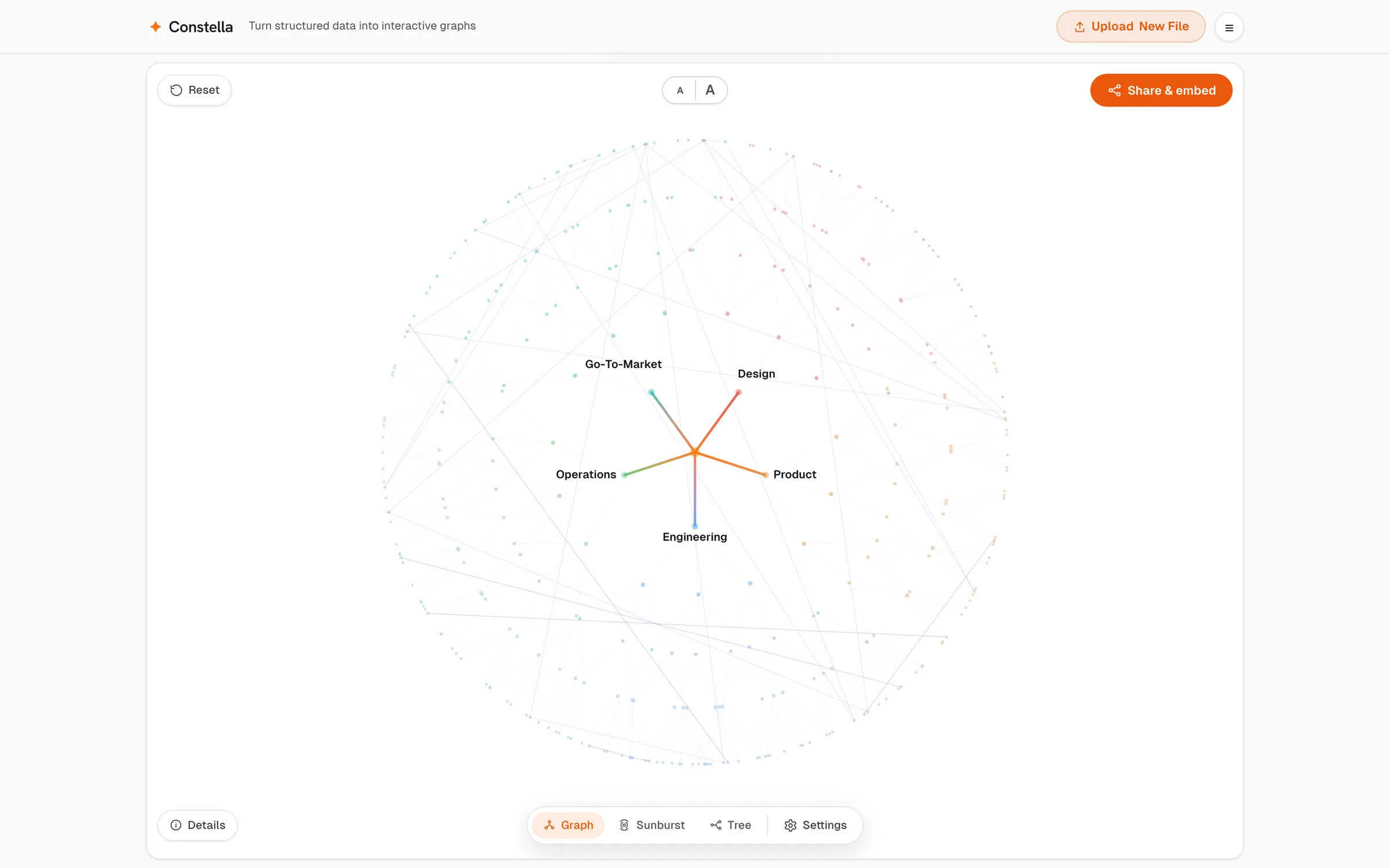
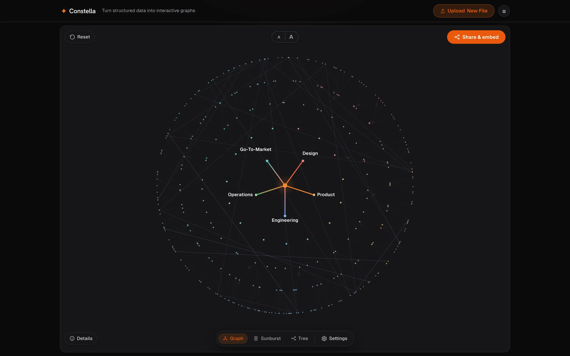
A client-side renderer for structured hierarchies: hand it a file you already have (a spreadsheet, a Markdown outline, a JSON manifest) and it gives the data a body. Three representations of the same parsed structure, an inspection system that meets the reader at the depth they choose, and outputs designed to live elsewhere. The product demonstrates itself at constella.anirudhux.com; this page is about the decisions underneath it.
How it got built
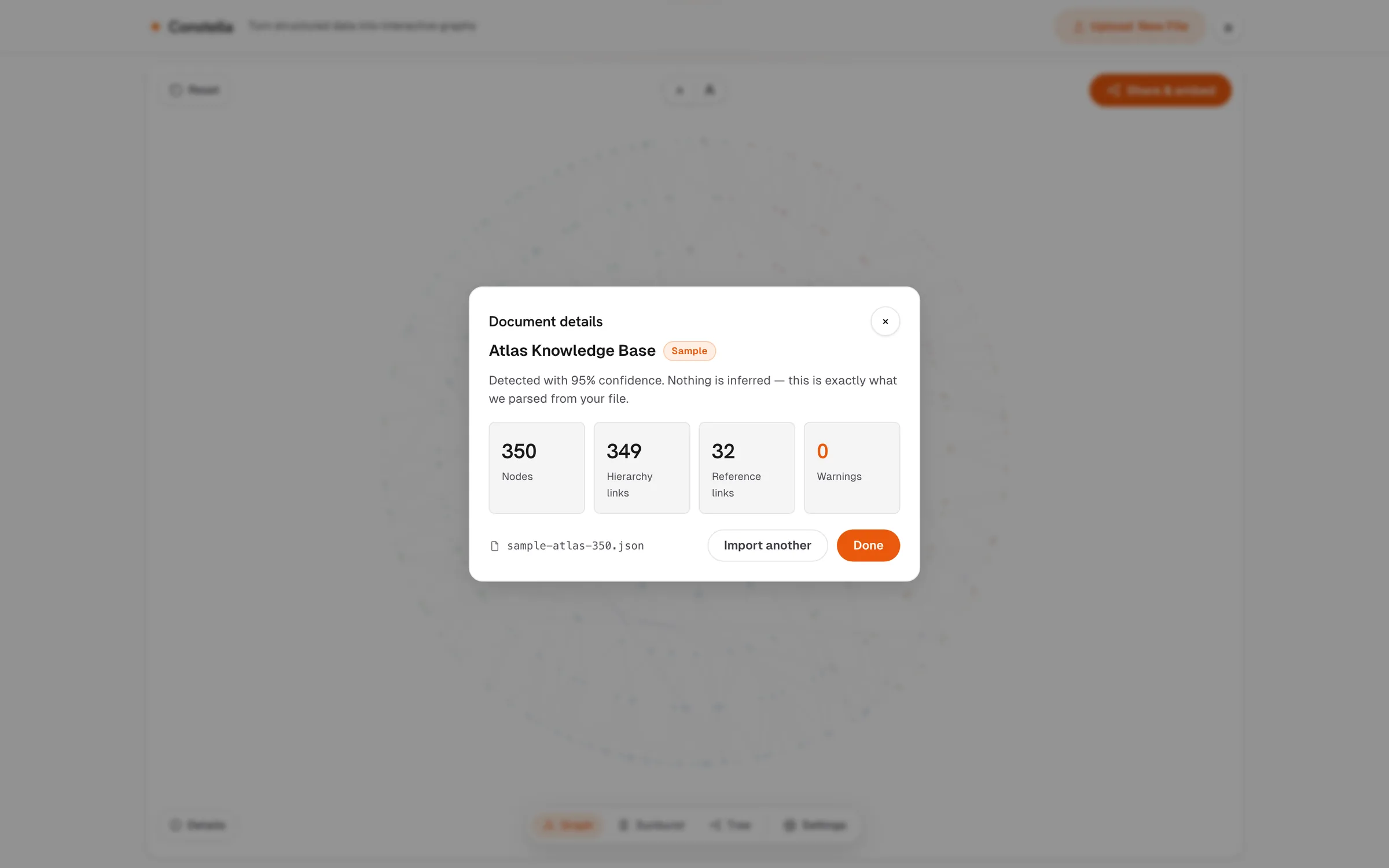
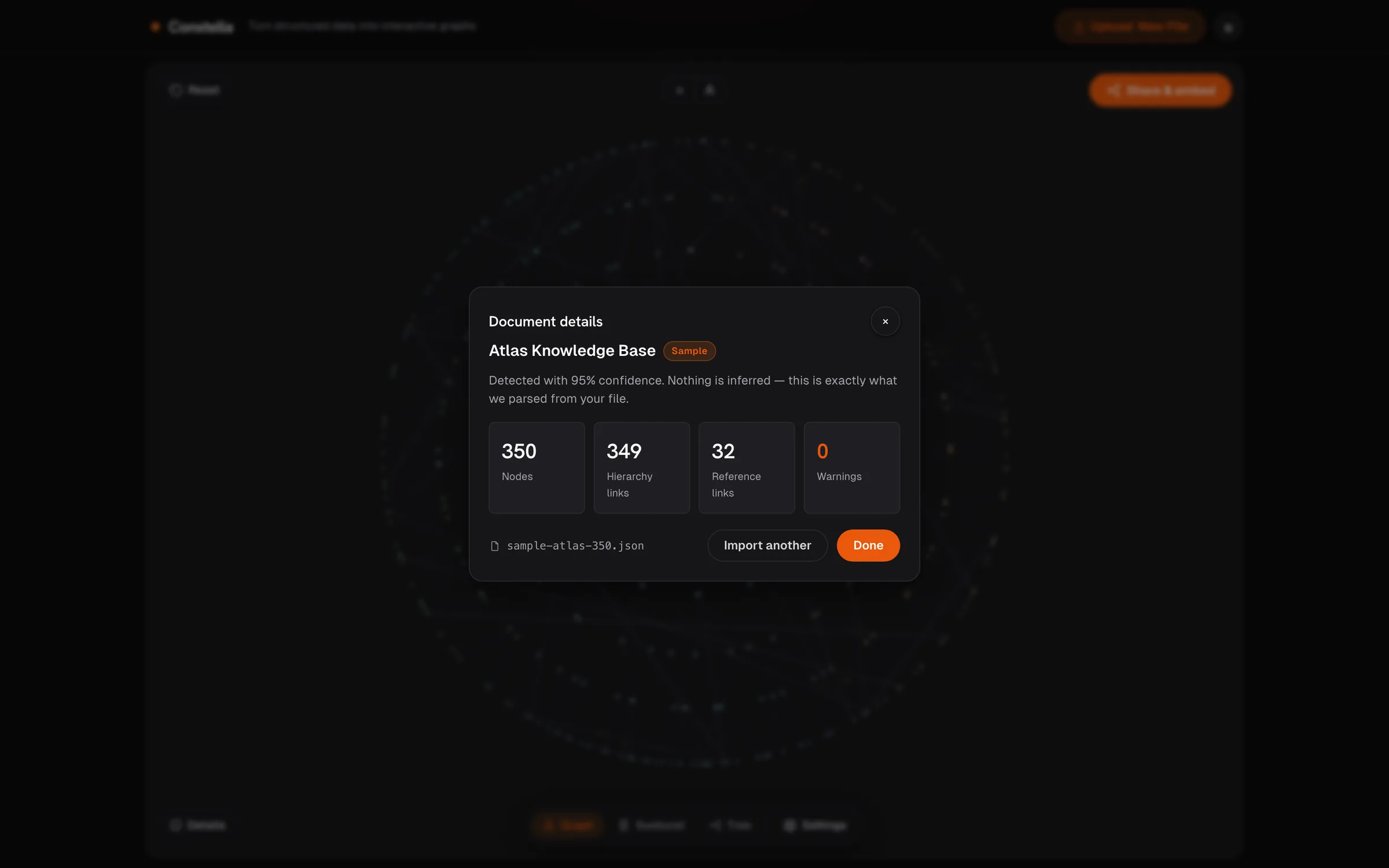
About a week, solo, with AI as the build accelerant; the sequence mattered more than the speed. Trust shipped first: before a second view existed, the import pipeline learned to report exactly what it parsed (counts, warnings, the source file named), because a visualization you can't audit is decoration. The representation work came after, on top of something already worth trusting.
Three refusals did most of the architectural work:
It refuses to clean your data. Structured input is the contract. The moment a tool starts repairing or structuring what you feed it, it becomes an interpreter of your data: it has to see it, judge it, and be responsible for what it decided. That is a different product with different failure modes and different privacy obligations. Staying out of that business is what keeps the rest honest.
It refuses to guess. Nothing is inferred; the graph can only show relationships the file actually stated. There is no AI anywhere in the pipeline: nothing summarises, nothing learns, nothing fills gaps. Deterministic in, deterministic out. The source file stays the only truth, which is also why there is no editing inside the viewer: a corrected copy would fork that truth.
It refuses a server. Parsing and rendering happen entirely in the browser. The privacy is a property of the architecture. There is no dimension in which a leak can happen, because nothing ever leaves the tab. Everything runs in your browser. No account, no upload.
Designing for density
Constella is built to hold up to 6,000 nodes. That number is a design ceiling rather than a target. The real work wasn't rendering that many points; anything can draw a hairball. It was building an interaction model that lets a person navigate extreme density gracefully without losing the macro-view. The sample map runs 350 nodes precisely because the interaction has to earn its keep at a size you'd actually use. The decisions that came out of that work:
Quiet by default. With hundreds of nodes on screen, the first problem is restraint. At rest, only the top of the hierarchy speaks; everything else recedes to context. Density is handled by discipline; nothing gets hidden.
Focus means the world steps back; it never rearranges. Attending to one branch dims the rest and shows the information's direction, root outward. The reader's orientation survives their attention; the map never shuffles itself underneath them.
Cross-links never disappear. Hierarchies flatter themselves; the interesting relationships often run across the tree instead of down it. Whatever branch you're reading, its references stay surfaced and their far ends stay findable. The tree is never allowed to hide the web inside it.
One truth, several mental models. Some people read space, some read proportions, some read lists. The same parsed structure renders as a spatial map, a radial whole-system view, and a plain collapsible tree; the representation adapts to the reader, never the other way around.
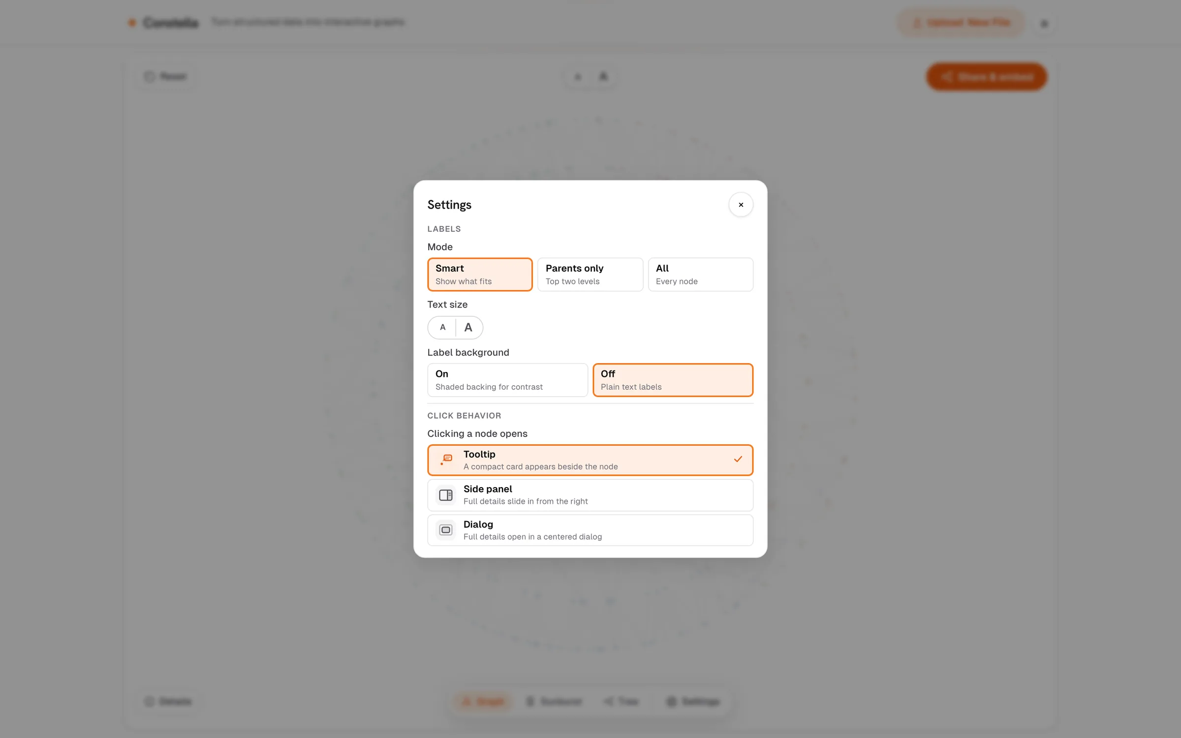
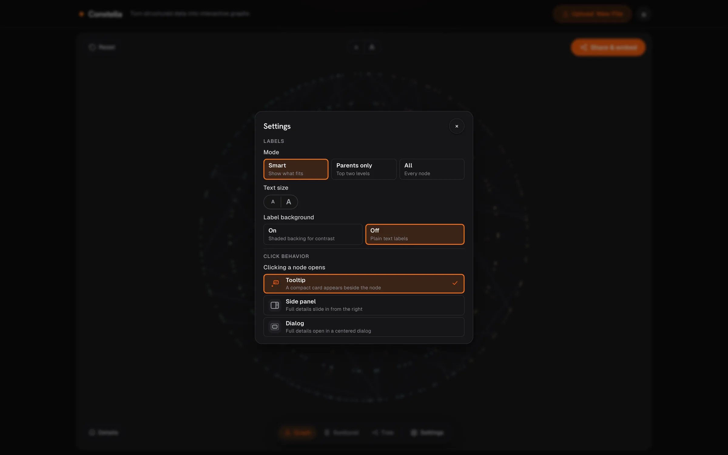
Inspection depth belongs to the reader. A record can whisper beside the pointer or take over a panel, chosen by the person looking rather than fixed by the tool. And the record adapts to what it describes: an org branch and a document don't pretend to be the same kind of thing.
Visualization types
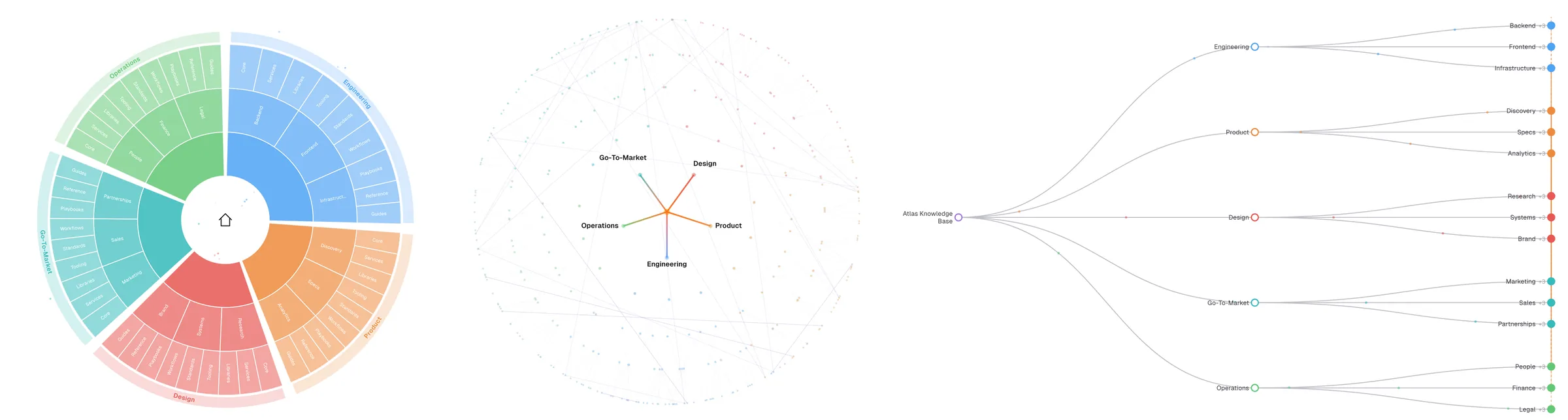
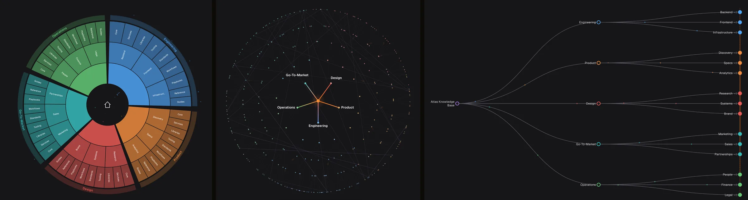
The three views exist because they answer three different questions about the same structure, and readers rarely know in advance which question they are asking.
The hierarchy graph is for orientation and discovery. When you don't yet know a dataset, the spatial map is the honest first encounter: cluster sizes, depth, and the cross-link web read as geometry before you've read a single label. It answers "what does this system look like, and where does the unexpected live": the dense pocket you didn't know about, the branch that barely exists, the reference that jumps across the whole map. It is the view for exploring; it rewards not knowing what you're looking for.
The sunburst is for composition and proportion. It holds the entire hierarchy in one frame, with every branch's share of the whole visible as area. It answers "how is this system divided, and which parts carry the weight": where the documentation is thick, where a domain is thinner than its importance suggests, whether the structure is balanced or lopsided. It is the view for auditing coverage and for presenting the whole to someone who needs the full picture in one glance.
The tree is for precision and sequence. A plain collapsible hierarchy, closest in spirit to the underlying file, walked one level at a time. It answers "is this exactly where it should be": verifying parent-child placement, reading a branch in order, checking the data itself rather than its shape. It is the fallback for anyone whose mental model is a list rather than a map, and the view you trust when correctness matters more than overview.
Outcomes
The strongest use so far was the unplanned one: turning a long research brief into a navigable object and sending it as a single file. A ten-section document that would have been skimmed top-to-bottom became something its reader explored: following sections into sub-points, watching where the cross-references ran, holding the whole argument's shape at once. The report that gets explored beats the report that gets scrolled past, and that outcome is the original thesis proven back: give knowledge a body and people handle it differently.
Shareable, embeddable, portable
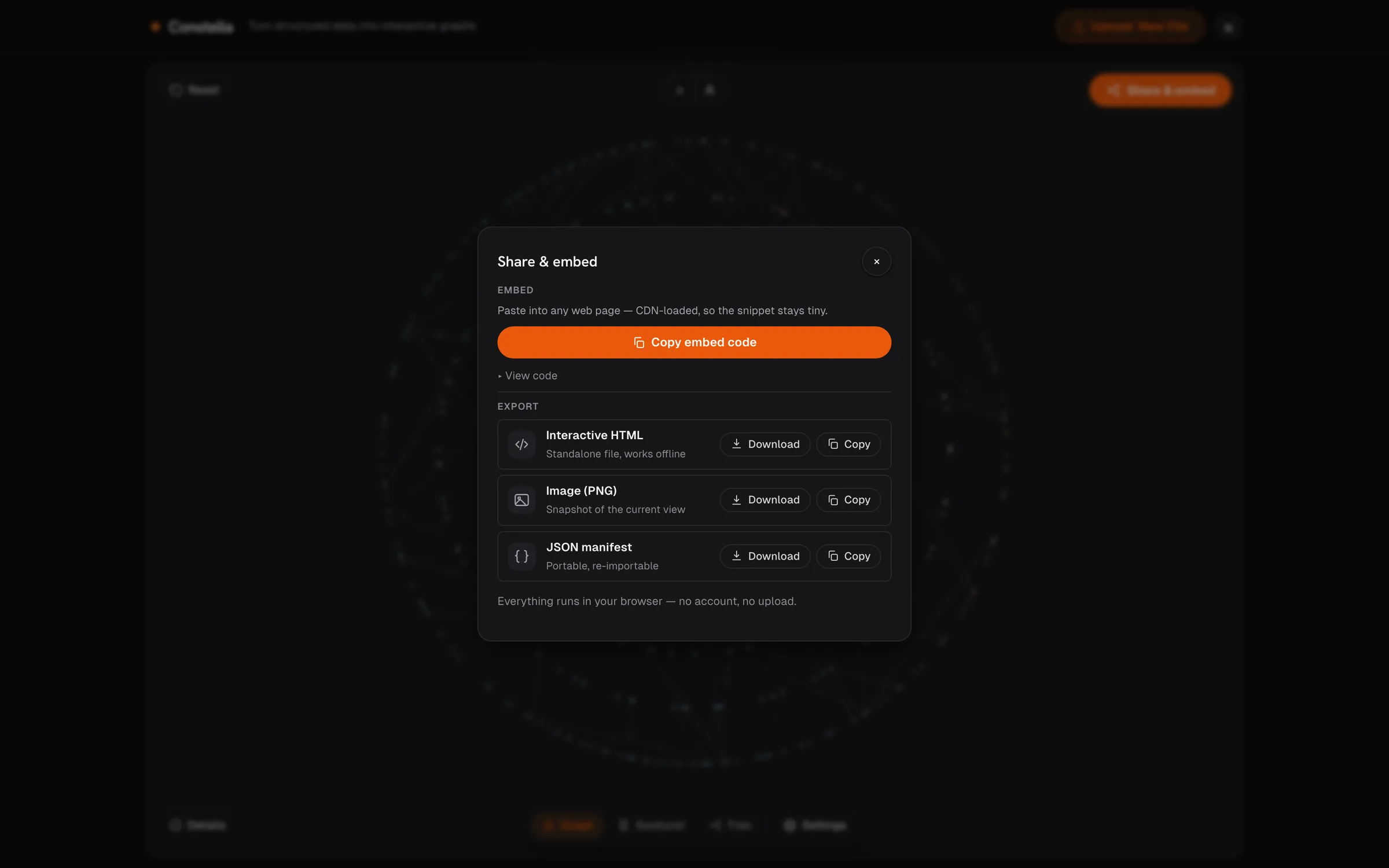
The session is not the output; the artifact is. Four ways out, each designed for a different afterlife:
The embed is a small snippet that drops into anything that renders HTML: a wiki page, a docs site, a blog post, an internal portal. The data travels inside the snippet itself; only the rendering engine loads from a CDN, which is what keeps the snippet small enough to paste. The page that receives it owns its graph outright: there is no account behind it and no service it depends on for the data.
The interactive HTML export is one self-contained file with everything inside: the data, the renderer, the interactions. It opens from disk, works offline, and needs no login, which makes it a genuine deliverable format: attach it to an email, archive it as a snapshot of what the structure looked like on a given date, hand it across an air gap. The person who receives it gets the living graph (hover records, focus, the lit lineage) with the authoring tooling stripped away. They get the reading experience without the tool.
The PNG is the deliberately static one: the current view, exactly as framed, for the places interactivity can't follow: slides, print, a chat preview, a report margin. What you framed is what ships.
The JSON manifest closes the loop, and the symmetry is the point: structured JSON is a first-class input, and the canonical output is the same structured, re-importable JSON. That round-trip means the graph's data outlives any one session and the tool itself: version the manifest in git, regenerate it from a pipeline, hand it to a colleague who re-imports it and continues where you stopped. Nothing about the format is proprietary or lossy; the structure you put in is the structure you get back.
Potential use cases
Anything with a hierarchy hiding inside it:
- Knowledge bases and documentation: the whole map instead of one folder at a time.
- Org charts and taxonomies: structure people, products, or content and hand it to someone who has to grasp it fast.
- Research and decision briefs: a dense document turned into something a reader navigates instead of skims.
- Dependency and citation maps: where the connections are the point, and a table can't show them.
- Information architecture: the shape of a site or product, laid out before it's built.
The common thread: data whose value is in how it connects rather than what it lists.
Where it's going
The build order so far tells the direction: trust first, representation second, discoverability next. Three concrete fronts are visible from here. Search, because at the design ceiling of six thousand nodes, finding one node without it means walking; the density work solved reading; retrieval is still open. The cross-link web as a first-class layer, because dependency and citation data deserve the same standing the hierarchy gets today. And the import receipt growing into a diff (what changed since the last file), which the in-place re-import already sets up: a receipt that can compare two imports turns a one-time reader into a repeat one. The product keeps its own dated changelog on the landing page, so the sequencing stays public and checkable.
Conclusion
Changing the shape of data changes how a person reasons with it. The same 350 nodes read as rows produce one kind of question ("what is this row?"), and read as topography produce another: "why is that cluster so thin, and what is that lone reference doing crossing the whole map?" The second kind of question is where understanding actually starts, and no amount of scrolling a table produces it. Overwhelming density becomes a navigable topography instead of a wall of rows, and the reader's behaviour changes with it.
The refusals were the method. Refusing to clean data eliminated an entire interpretation layer with its own failure modes and privacy obligations. Refusing inference eliminated model evaluation, hallucination handling, and every conversation that begins with "why did it draw that?" Refusing a server eliminated auth, storage, and the whole security surface. A week was enough time precisely because the product declined to be three other products; the scope discipline did the work a roadmap normally does. The constraints were the mechanism.
Sequence mattered as much as scope. Trust shipped before the second view existed, because a visualization tool earns attention with auditability before it earns admiration with rendering. And the phone layout was designed before the desktop had settled, because a small screen is an honest editor: whatever survives it deserves its place everywhere else. Both orderings were bets that paid off in kind: the receipt is why the graph gets believed, and the mobile discipline is why the canvas stays clean.
Last, the distinction this project runs on: it was built with AI as the force multiplier (a week of solo work carried scaffolding, renderer plumbing, and iteration speed that would otherwise have taken a month), yet the product itself has zero AI in the loop, because a visualization you can trust has to be deterministic. The build labour was accelerated; the judgment calls (what to refuse, what a click means, which view answers which question) stayed human. Knowing where AI doesn't belong is part of building with it, and that boundary is itself a design decision.