Introduction
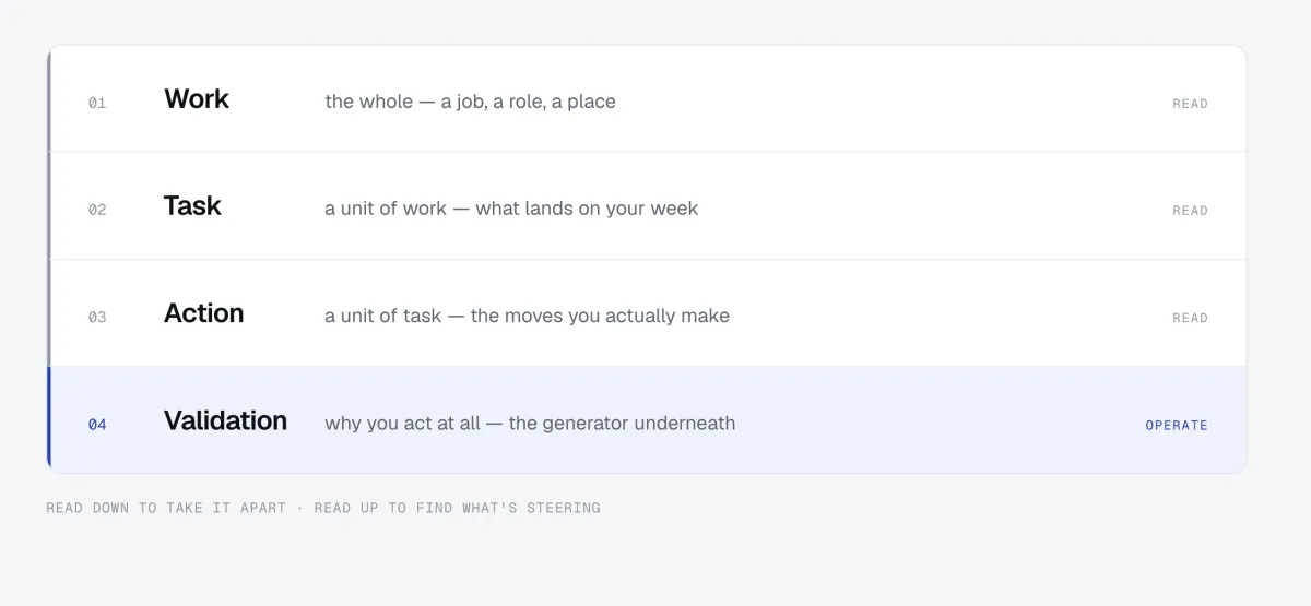
The Ennoventure design system is built with high authorship and in a proper Author-Subscriber model, which means that the human in the loop is actually the author and the gatekeeper of the design tokens, which are sacrosanct. The components are built based on specifications by AI agents that have access to these tokens but cannot edit them; the tokens are non-fungible by default, the components can be.
Principles of Atomic Design but applied to Agentic workflows.
- The tokens cover typography, colour, spacing, radius, and interaction states.
- The components built from those tokens, and the rules for how the two combine.
- The components run from buttons up to full page shells.
- All of it lives in one documentation page with a JSON export in the W3C Design Tokens format: everything in a single place, everything verifiable, everything both a human and an AI can interact with.
Usually the design team would sit down and make things in Figma. The world had changed, so I took the agentic path: I defined the tokens myself, and an agent built the components against them.
Typography
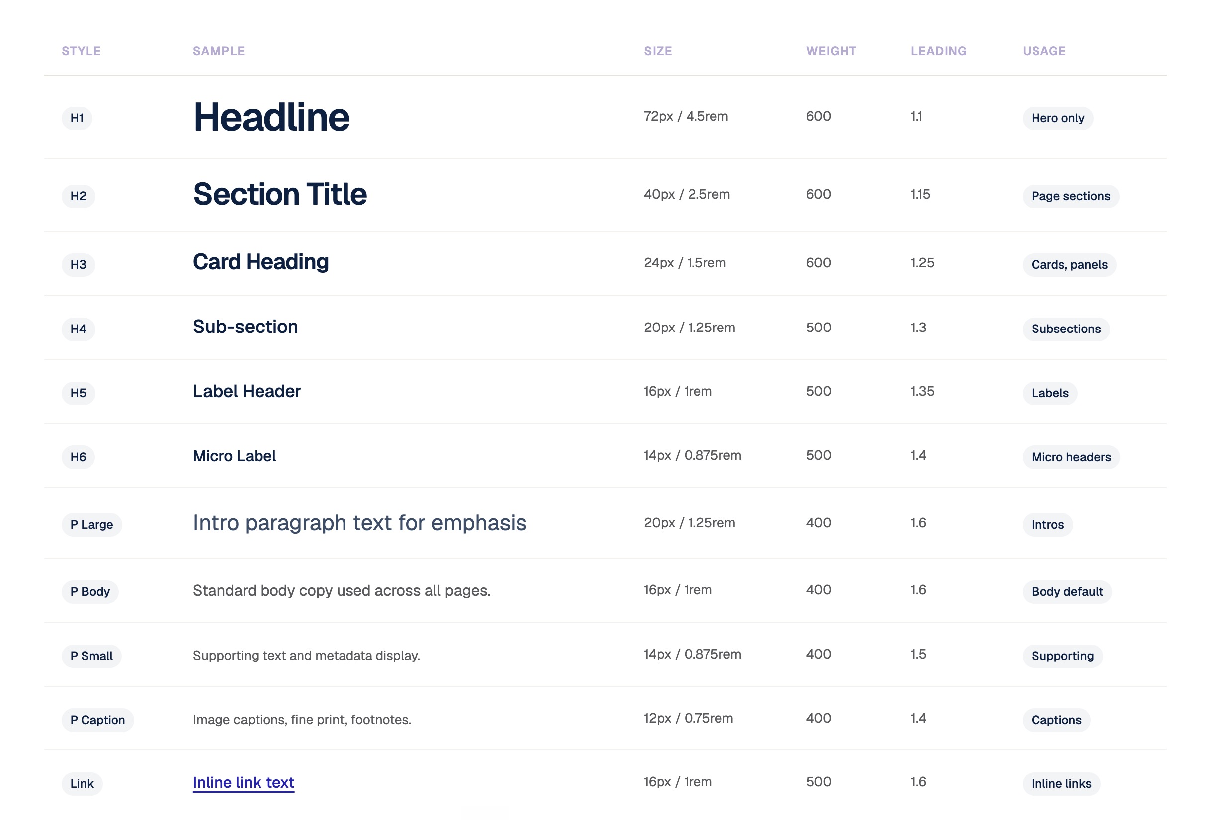
The typography is the scale. Eleven styles on a 16px base, anchored in rem. We fixed the lead. We fixed the styling. We fixed the baseline. H1 runs 72px at weight 600, used once per page as the hero and nowhere else; the scale steps down through H2 to H6, then P Large, Body, Small, and Caption; Link has its own style; and a 10px uppercase Label exists for eyebrows and table headers. Every style carries a usage note.
Colors
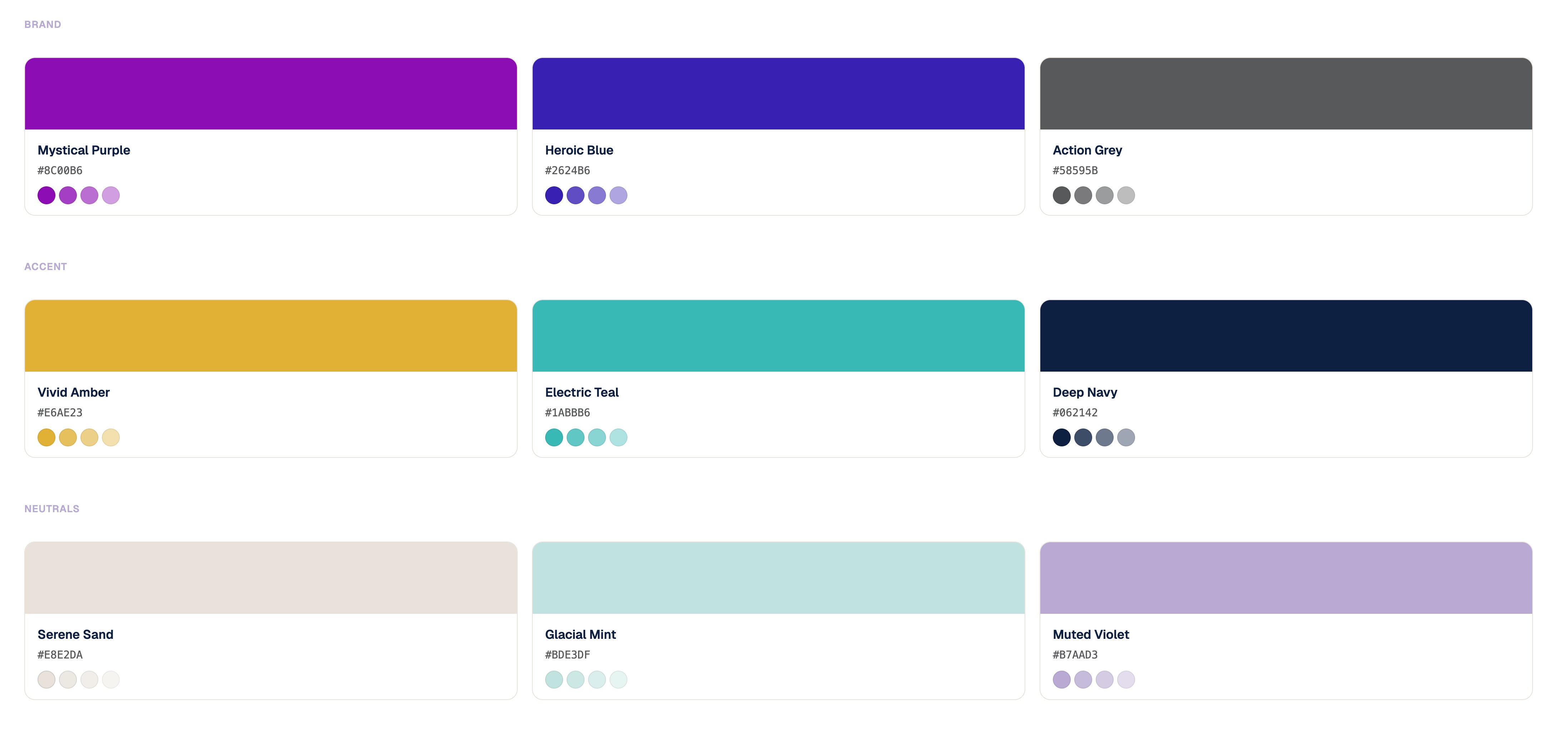
Colour came in three tiers: brand, accent, and neutrals. Nine tokens, each named and hexed. For the longest time we had made do with Mystical Purple, Heroic Blue, and Action Grey; the accent and neutral tiers existed and went unused. Because we worked with print, we stayed mindful of CMYK, and CMYK has no transparency; the system stuck to digital for now. What I introduced was the transparency matrices: this is the main colour, and we use 20, 40, 60, and 80 percent at different levels for different usages. Each step got codified as a token against its usage.
Because AI was going to use this system, I also put the text rules in place: what colour gets used with what. Headings in Deep Navy at 100 percent, body in Action Grey, subtitles in Deep Navy at 60 to 80 percent, links in Heroic Blue. Surfaces and strokes got codified the same way: white page background, a Serene Sand tint for panels and section alternates, the sand stroke for default dividers and card borders, the Muted Violet stroke for focus rings and active states. One rule throughout: opacity applies at the element level, never directly on a text token.
Spacing
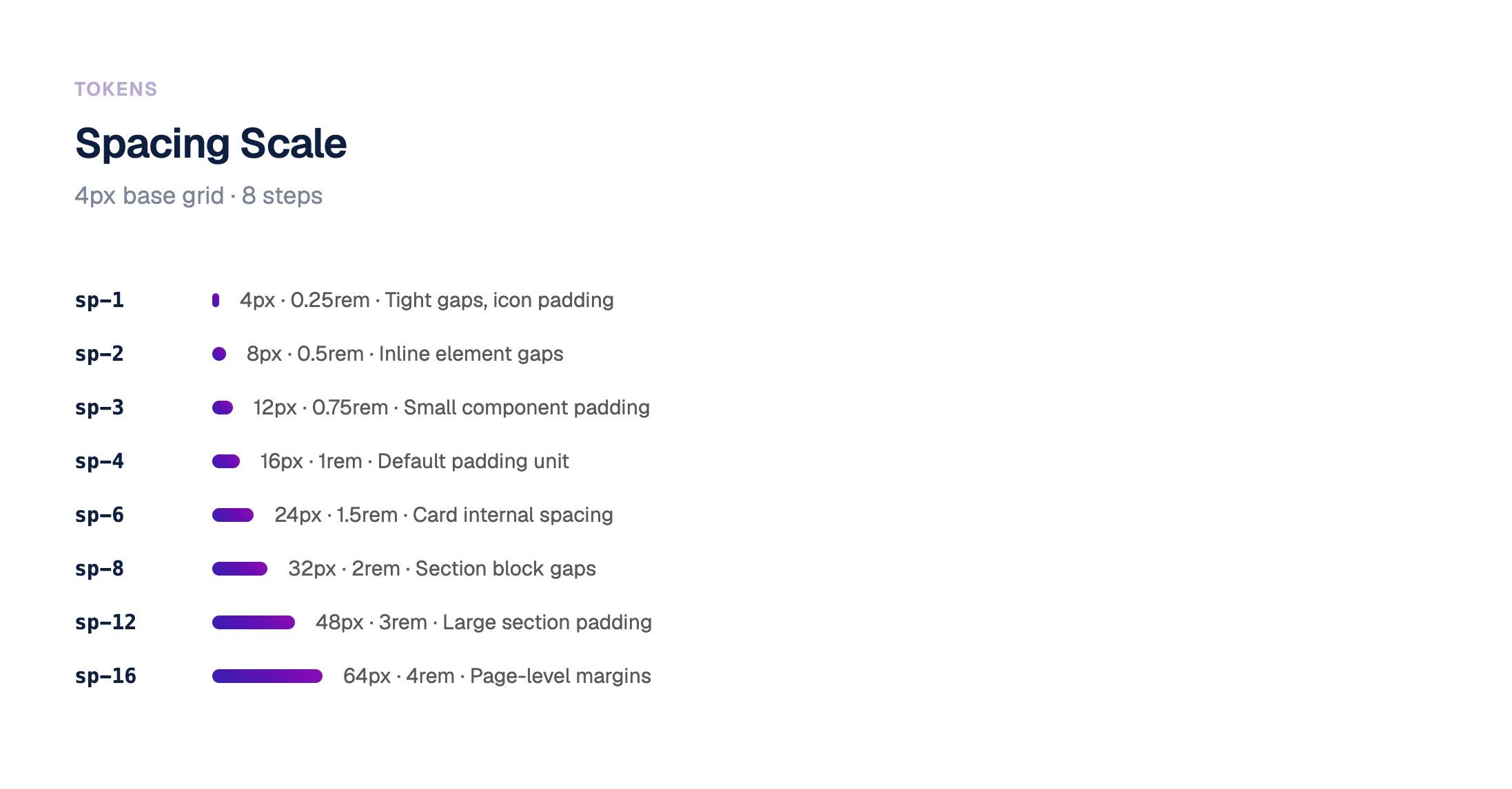
The biggest friction point between design and engineering is the spacing between components, which is why spacing became the most tightly codified token family in the system: a 4px baseline, anchored the same way rem anchors the typography.
Border radius
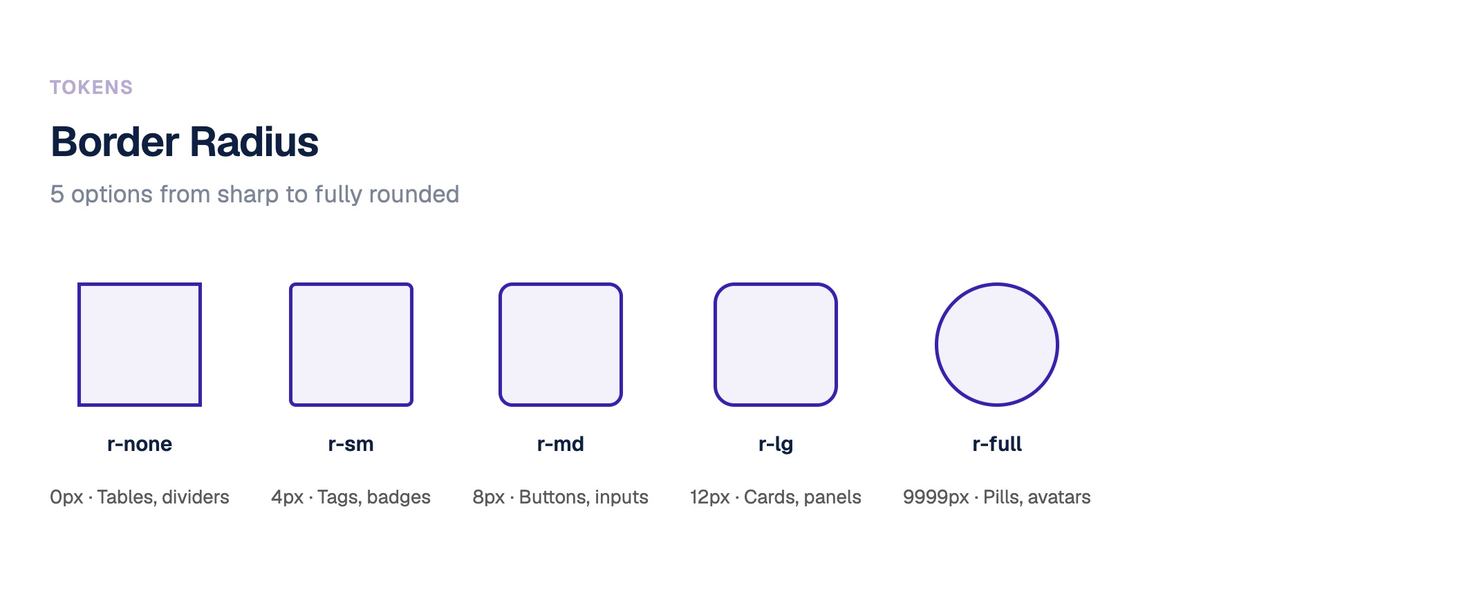
Border radius runs five steps from sharp to fully rounded, tables to pills. Buttons run three variants across three states, every value specified to the hex or the rgba. A gradient is two tokens interacting with each other, enclosed within another token and defined by yet another, in three treatments: fill, stroke, and ghost.
Interaction
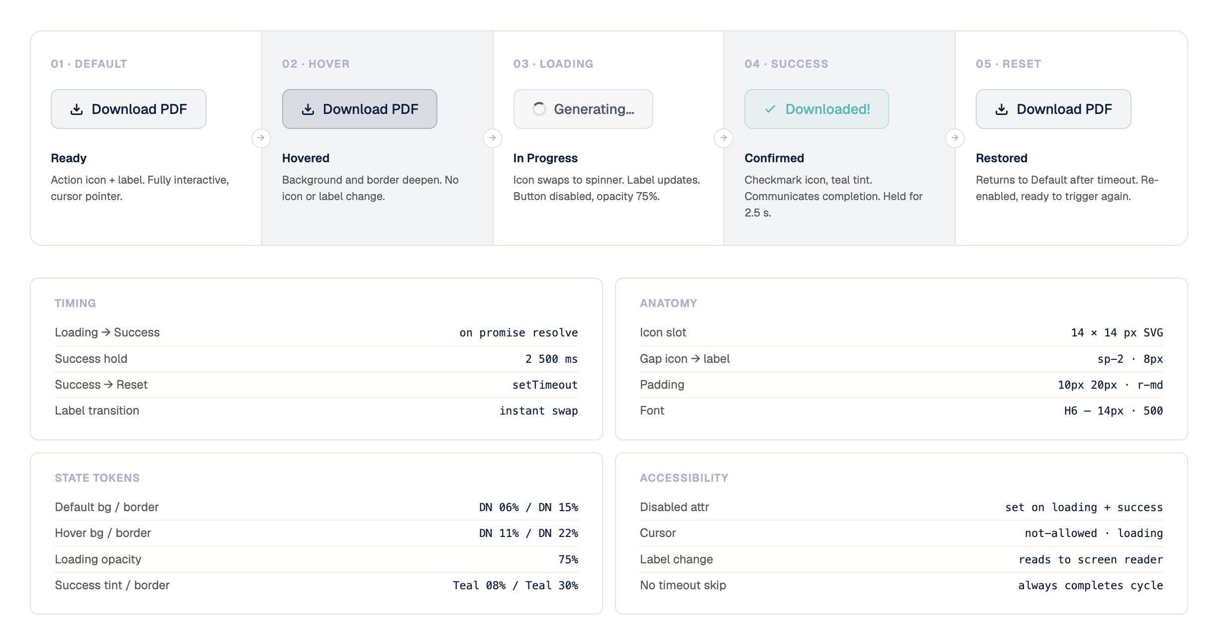
The async CTA is the densest single artifact in the system. Five states: default, hover, loading, success, reset. Success holds for 2.5 seconds and returns on a timeout nothing can skip. The label swaps instantly and never wraps; the icon slot never resizes, only the SVG path changes, so the label never shifts. Hover deepens the fill and the border and touches nothing else, so the affordance reads before the click. Success renders teal so it cannot be confused with loading. On error the checkmark never appears. Eight written rules for one button, and its scope stated: any single async CTA, never navigation.
A Modern Design System
Human Authored
The tokens were tightly defined, human-defined, and human-gated. I built the baseline myself: every colour, every font size, the whole spacing system; that layer stayed mine to define and evolve throughout. Only then was the agent allowed in: give the agent plain markdown directions and ask for one component, and it would create four different components instead of one, because it would not understand what the spacing, the padding, or the radius should be. The tokens ended that: strongly typed, made sacrosanct.
Fully AI-Agentic
Components were built in Claude Code and Cowork, one by one, each against a primitive I built and fitted first, with me repeating and correcting the agent as needed. Once a component shipped it became view-only: nobody can add to it, nobody can edit it, the agent included, without the designer's authority. One system, everywhere. The library grew from primitives to shells: buttons, badges, inputs, toasts, tables, charts, steppers, skeletons, modals, map panels, and the sidebar and page shell that Ennteract 2.0 runs on; twenty-four component families, zero hardcoded values, every one reaching into the tokens.
Shipped through GitHub
The tokens and the component library live in a private, company-controlled GitHub repository. I pushed to production directly; engineers, or their front-end agents, pull the requisite code against the build request, and fully synthetic UI gets built out in minutes. The system grows through pull requests, reviewed like any other code. No Figma anywhere in the chain.
The conclusion
Takeaway
I could get Claude, or any LLM service, or Cursor to start building my own designs in the front end, summoning the components and mixing and matching, without having to rely on front-end developers. A POC or an MVP would be ready from my end without having to involve or wait for anyone.
Performance
Before the system, one UI left design roughly every six days, at about 85 percent ready. Two weeks after the system shipped, we were putting out three fully finished features every ten business days: a desktop form-factor feature or a five-to-six-screen mobile workflow each, and that is the conservative count.
Impact
The system worked flawlessly across the dashboard, both apps, and the extension dashboards we created on the fly for a few customers. The tokens stay the single mutable layer and stay with the designer, components lock on ship, and the library grows through engineer pull requests. The whole thing was built by one person and one agent over April and May 2026.