PhonePe moves money for 400 million people inside one app. The buying itself happens elsewhere: on a small merchant's website, a Shopify storefront, an Instagram shop with a payment link. Between those two worlds sits a checkout form asking the shopper to type a name, an address, a phone number, and card details into a site they met five minutes ago.
ExpressBuy was the bridge: one tap on the merchant's page, and PhonePe carries the address and the payment while the merchant keeps everything else. This is the story of designing a checkout for storefronts PhonePe does not own, and of what a zero-to-one experiment is actually for.
I did none of this alone. Amit Vernekar, Roopa Nadgiri and Ashna Jain were in the room throughout; this page is partly their record.
A mature app hunts for deeper moats
ExpressBuy belongs to the same phase of PhonePe as UPI Lite, UPI International, and the B2B payment gateway: the app's maturity was high, and the company was probing avenues to grow business viability on its own strengths. Modern Indian fintech forces that question on every player past a certain scale. The moat has to keep deepening, and the way to deepen it is to use the data you already hold and turn your systems and workflows into connectors.
ExpressBuy was named a zero-to-one experiment on day one. That framing matters for how this story ends.
The dormant asset
A substantial share of PhonePe users have stored their addresses in the app: voluntarily, in one place. Payments behaviour on one side; self-declared delivery metadata on the other. The strategic question underneath ExpressBuy was blunt. Beyond serving users better, how do you begin productizing that database?
A thin slice of the gateway
The full B2B payment gateway serves merchants with volume. A D2C seller running a WooCommerce store or an Instagram shop cannot justify that onboarding. ExpressBuy took a smaller snippet of the gateway; the rails, bonds, and structure already existed; and added an address layer and ease of payment on top.
The pitch to a small seller was simple: concentrate on your own value proposition, and hand the complicated bits back to us; the addresses, the phone numbers, the payments. Logistics stayed with the merchant in version one, and even that boundary was a roadmap: a courier and logistics partnership surface for later. An ecosystem play, built from existing data.
Three rungs, one ladder
The phone decides the flow.
- App installed, logged in: the cart hands off to PhonePe and the user pays in familiar chrome.
- App installed, logged out: a bottom sheet on the merchant's own page collects phone and OTP; the browser session vouches the user into the app. The seam gets crossed once, already authenticated.
- No app at all: the entire checkout runs on the web with PhonePe as an embedded sheet, ending on the standard NPCI PIN pad; the one screen every UPI user already knows stays untouched.
Each rung keeps the same assets in play: the saved address, the saved instruments, the verified phone. The web path even carries cash on delivery, because the merchant conversation demanded it.
The handoff, in order
The happy path is a sequence argument. Detect before promising: the embedded script checks for the app on the phone before offering it. Consent before takeover: a PROCEED button on the merchant's site takes the user's explicit yes; the flow never yanks anyone into the app. Transfer, then land: the cart context crosses over, and the user arrives on a Pay to screen where the merchant is named, the order is summarized, and the delivery address is already filled.
That prefilled field is the entire business case rendered as interface.
The boundary is drawn on ownership
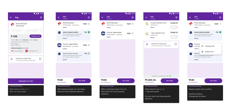
The division of labour held on every screen. The merchant defines the cart items, the coupons, the shipping options and their prices. PhonePe holds the address and executes the payment.
On the web path, coupon and cart metadata never leave the client. Inside the app, coupon data rides along and renders in PhonePe chrome; its rules, validity, and economics stay the merchant's throughout. The cart view is read-only on both sides by design: the checkout shows the cart; it never owns it. A payments company that can see a merchant's discount strategy is a payments company merchants hesitate to embed. Refusing the data we did not need was the trust story, made structural.
Coupons that do the arithmetic
The coupon sheet carried an intelligence layer: a Max Savings chip tagging the best pick, so the system does the arithmetic the user would otherwise attempt across three near-identical codes. Full terms sit behind a Show More. Applying takes a deliberate beat of loading; long enough to read as real work; and lands on a celebration that names the saving in rupees, since ₹150 is the number the user feels and the code is just the key.
The applied coupon then reshapes the order in place: a two-day shipping option flips to zero rupees with the discount narrated on the option itself, and the total drops on screen. Manual code entry sits above the list for the user who arrived holding one.
The flywheel
Addresses are optional on PhonePe, so the checkout could never assume one. When none exists, an inline frame on the merchant's page collects a delivery address; saved as Home, Work, or Other; and writes it to PhonePe's database.
The asset that powers the checkout gets refilled by the checkout. One screen is simultaneously the productized database and its own acquisition channel.
Instruments and modes are different questions
The landing screen already carried the merchant's identity, the cart summary, the address, and the coupons. Asking for the payment there as well would have been heavy on the shopper. And PhonePe already had a payment surface: the bottom-sheet instrument list, which does one job well; it picks how money moves. Payment modes ask a different question entirely: whether money moves now, at the doorstep, or on some future rail. Forcing modes into the instrument sheet would have broken the app's system design by retrofitting.
My call: a separate Payment Summary page. Modes live there as first-class options with room for whatever comes later; pay now, pay on delivery, pay later, priority tiers. The amount breakup stays visible without a tap: order amount, shipping charges, pay-now charges, total payable. Choose pay on delivery and the button changes its verb to PLACE ORDER, because no payment is happening now and the button stops claiming one. When the user does proceed to pay, the familiar instrument sheet opens, unmodified.
The journey home
The user started on the merchant's page, so the flow must land them back on it. Payment processing holds the user with an honest wait; the green confirmation says what happens next: redirecting you back to the merchant. The pay-on-delivery variant says Placing the order instead, carrying the verb honesty through to the end state.
The last screen belongs to the merchant's systems: "Almost there! We are confirming your order," with a live countdown. Confirmation now depends on the merchant's own gateway or CRM, and the design admits that seam rather than performing certainty. PhonePe confirms the payment, because that is what PhonePe did. Only the merchant can confirm the order.
The record: success, failed, pending
The post-transaction screens are the fintech obligation. One anatomy across all states: transaction ID with a copy action, delivery details, items, the amount breakup, the debited instrument with its UTR. A green header for success, red for a failed transfer, orange for a payment in progress.
Every state carries the same note: "Your order will be delivered by BookMart Books. Please contact them for your queries." The data boundary spoken as a responsibility boundary, at the exact moment a user would otherwise ask the wrong company where the parcel is. The action row says the same thing in layout: merchant support, merchant website, merchant email first; PhonePe support last.
The ending: de-prioritized, and I don't know
The pilot ran on a couple of merchants. The impact numbers stayed opaque to me, and I left PhonePe before a verdict landed. I would rather say that plainly than dress it. What I can report is what slowed the project, because the constraints are the education:
Ecosystem readiness. This is a product that works only when many players show up at once: a sizeable pool of willing merchants, platform connectors, partner integrations. Nothing about it is plug-and-play, and the product is only as strong as its weakest partner category.
The address quagmire. The asset's quality was unproven. Are user-entered addresses accurate? Verified? Vetted? None of that machinery lived in PhonePe's ecosystem. Address-provider partnerships were floated, and every route through them ran into privacy: tapping phone numbers is a breach, linking addresses to numbers is worse, and the one clean path, explicit opt-in, adds its own hurdle to the funnel. The moat thesis met its limit here. The data exists; productizing it safely costs funnel.
Unit economics. The numbers work only when the D2C market is actively asking for this, and market research at that magnitude was never commissioned before my time ended. The business and the finances were waiting on each other.
A zero-to-one experiment exists to surface exactly these constraints. This one did its job; the organisation priced what it learned against other bets and moved on.
What I took from it
How to design a product whose first screen sits in a rival's button stack. How to draw a data boundary that doubles as the sales pitch. How to split a checkout so that future payment modes have a home the current system never promised them. And how to close a case study without numbers: report what the experiment learned, and let that be the ledger.